
Case Study: Vežbaonica
Launching a Personal Training Studio Online With a Website That’s Fast, Bookable and Easy to Edit
Vežbaonica is a private personal training studio in Niš, Serbia, run by two coaches with master’s degrees in sport and physical education. One-on-one and two-person sessions only, and every new client starts with a free 30-minute assessment.
- Mobile Performance
- 97/100
- Whole Page
- < 300 KB
- Industry
- Fitness
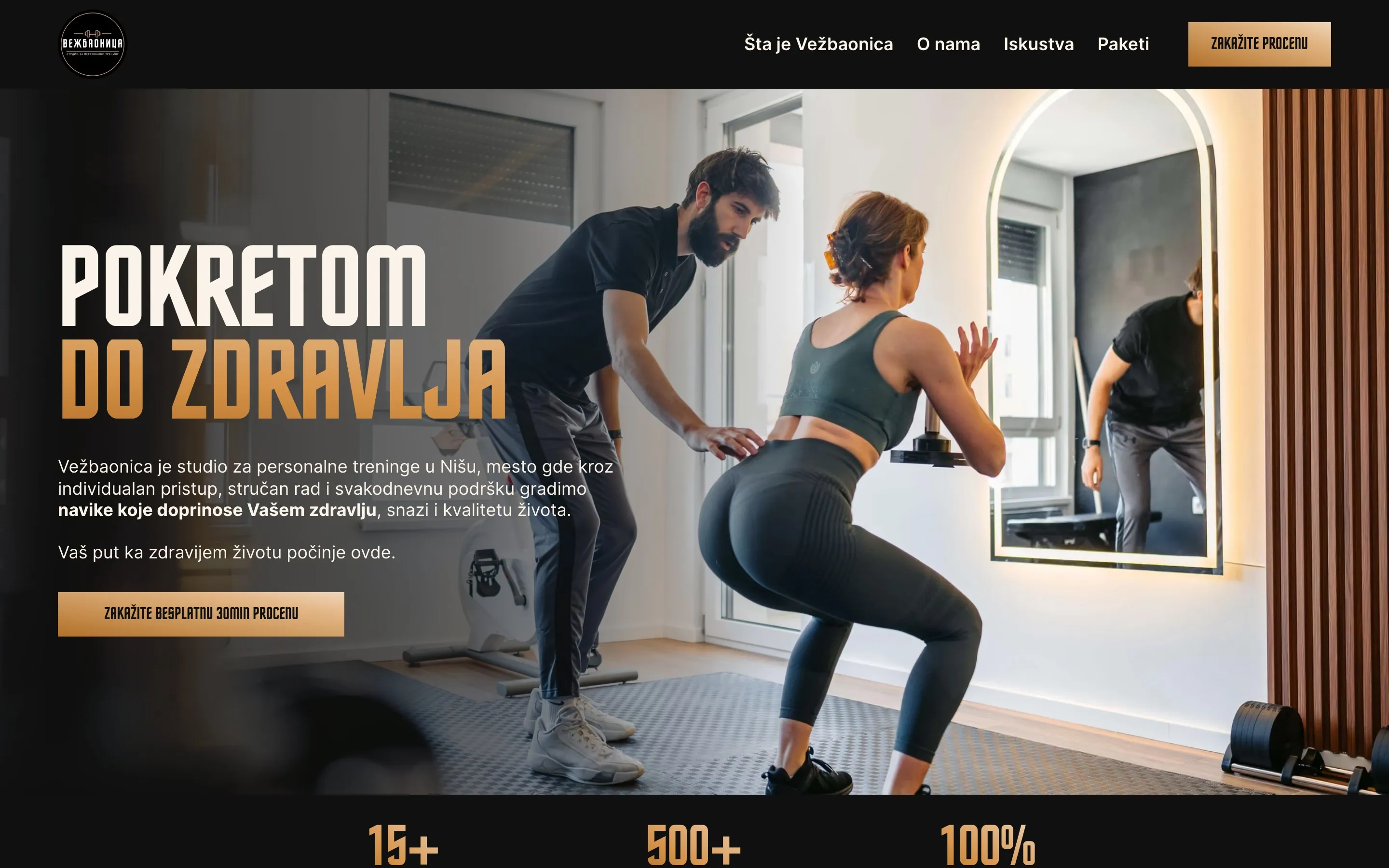
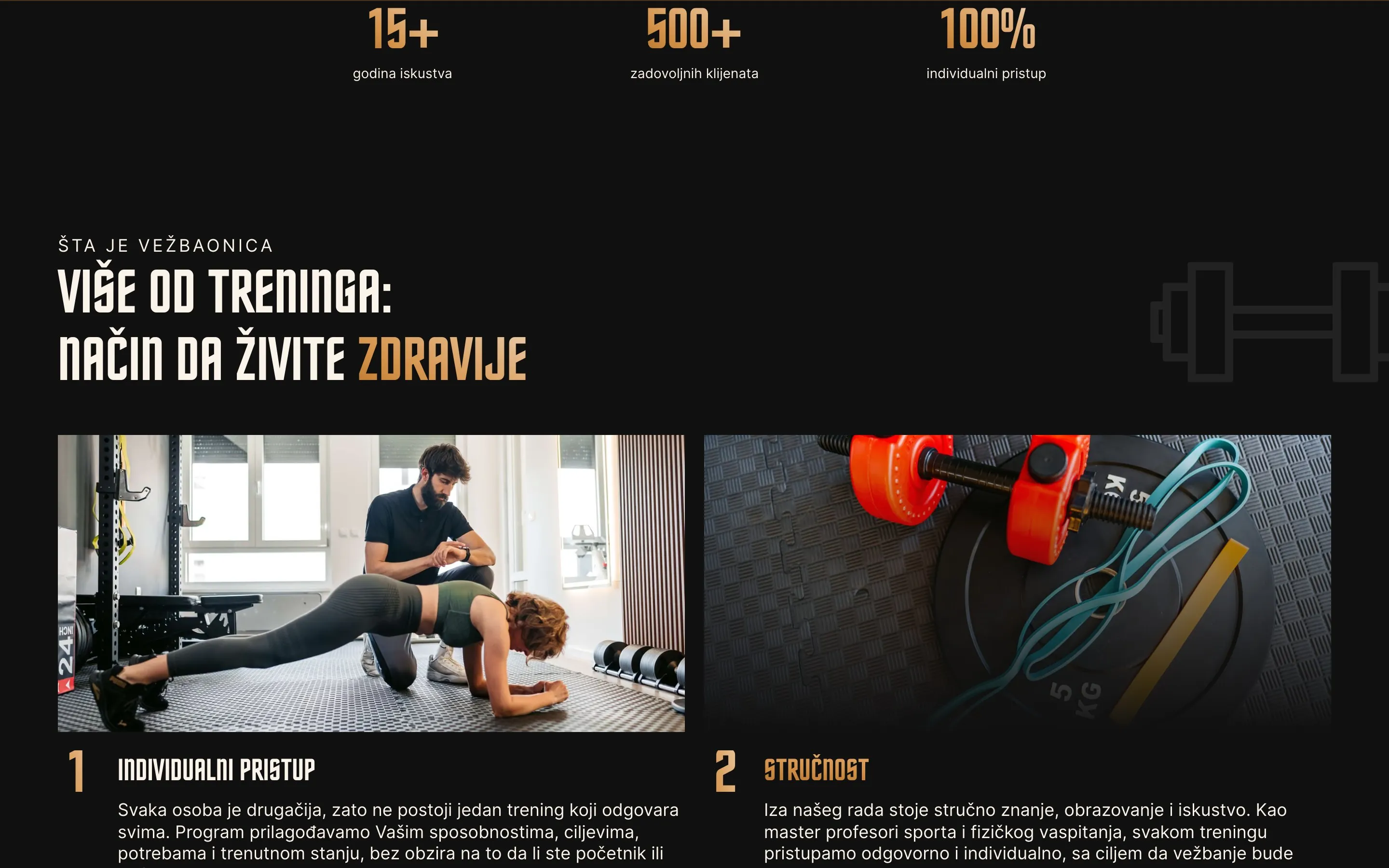
I designed and built Vežbaonica’s website from a blank Figma file to launch: one page that explains the studio’s approach, introduces the coaches, shows real client results and lets visitors book a free assessment without leaving the site. The owners update the content themselves, without touching code.
The Problem
Vežbaonica opened in April 2026 with an Instagram profile and nothing else. Every booking started as a DM, which meant:
- People who found the studio on Google, or heard about it from a friend, had nowhere to land.
- The coaches’ qualifications and the private, two-people-max format were easy to miss in a feed.
- Prices, times and “what happens at the first session” were answered one conversation at a time.
The studio needed a home base that explains everything in one scroll and turns interest into a booked assessment.
The Goal
- A site that feels as premium as the studio, designed phone first.
- One clear action everywhere: book the free 30-minute assessment.
- Content the owners edit themselves: coaches, testimonials, transformations, packages and FAQs.
- Fast and findable on Google for personal training in Niš.
What I did
- Web Design (Figma)
- Custom Development
- Sanity CMS Setup
- Online Booking (Cal ID)
- Local SEO & Analytics
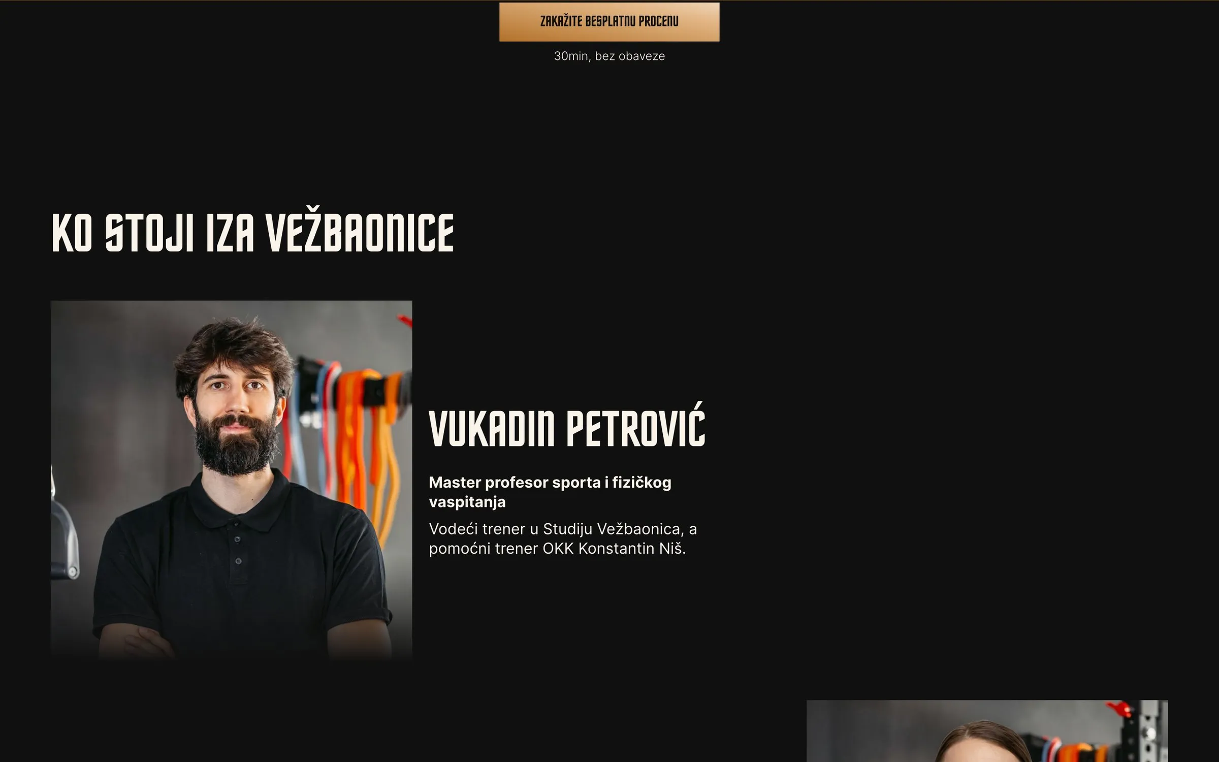
The Solution
I designed the site in Figma for phone and desktop, then hand-coded it: no page builder, no theme.
What I delivered:
- Custom design in the studio’s black and gold, with photos cropped exactly as designed on every screen size.
- Booking on the page: visitors pick a time for their free assessment right in the site (Cal ID).
- Sanity CMS with an editing Studio in Serbian and a live preview of unpublished changes. Publishing updates the site in about two minutes.
- Speed built in: modern image formats in several sizes, trimmed fonts, no layout shift.
- Local SEO and analytics: structured data with address and opening hours, a sitemap, and privacy-friendly cookie consent with GA4 events.
From the first design to launch took about two weeks.
The Results
The site went live in October 2026, so it’s too early for booking numbers. What I can measure already:
- 97/100 mobile performance on Lighthouse (100 on desktop), and 100 for accessibility, best practices and SEO.
- Under 300 KB for the whole page, so it loads fast even on a weak mobile connection.
- The owners can publish new testimonials, transformations and packages without a developer.
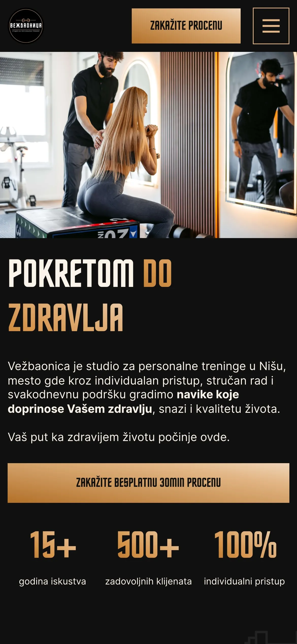
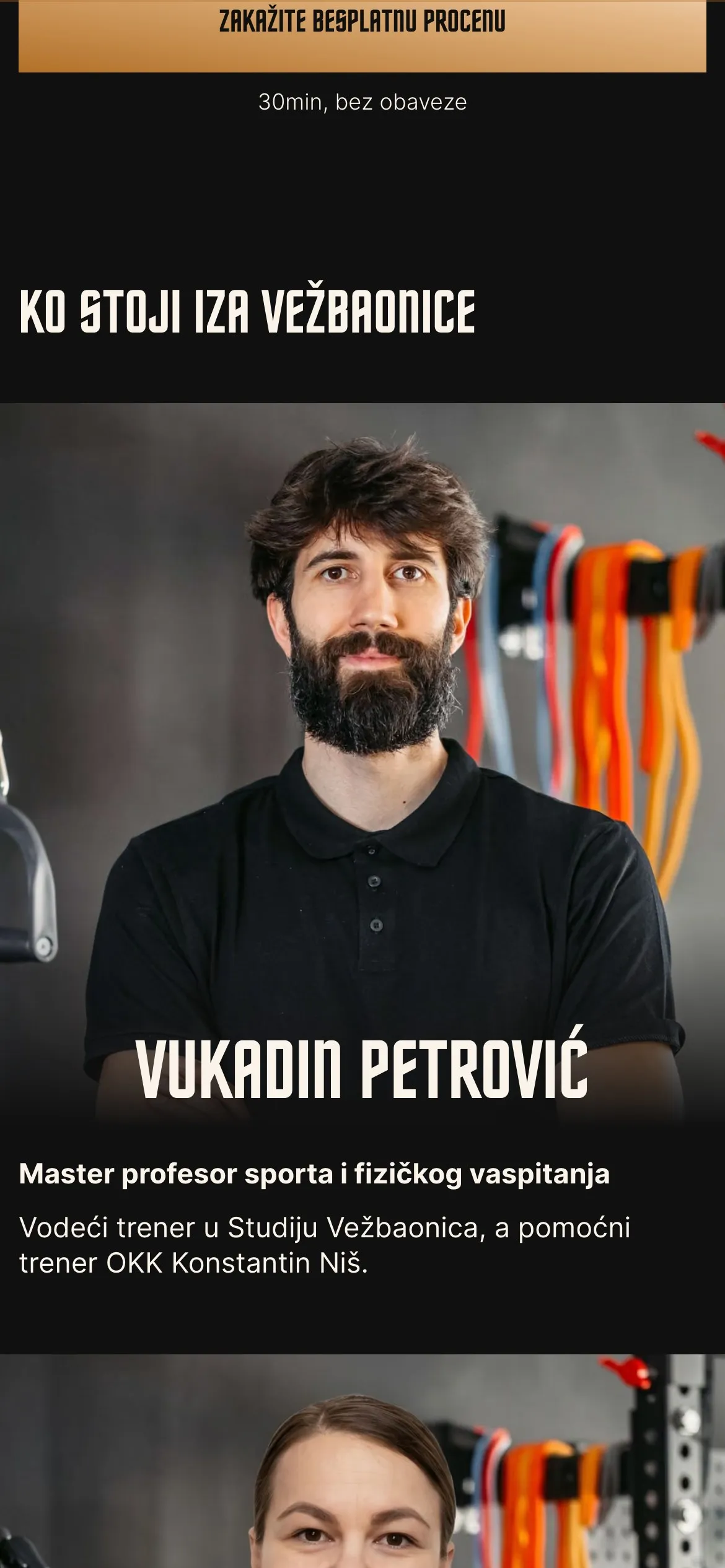
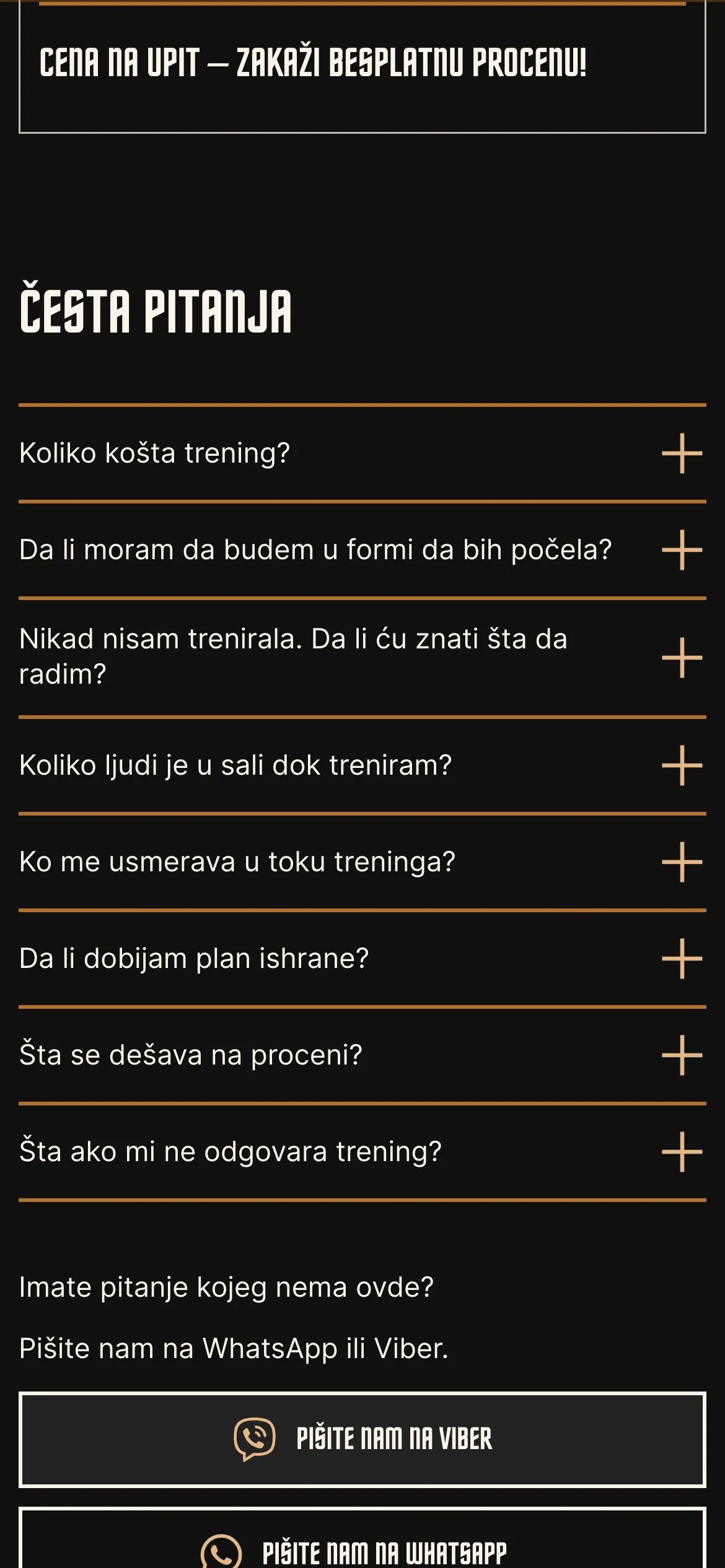
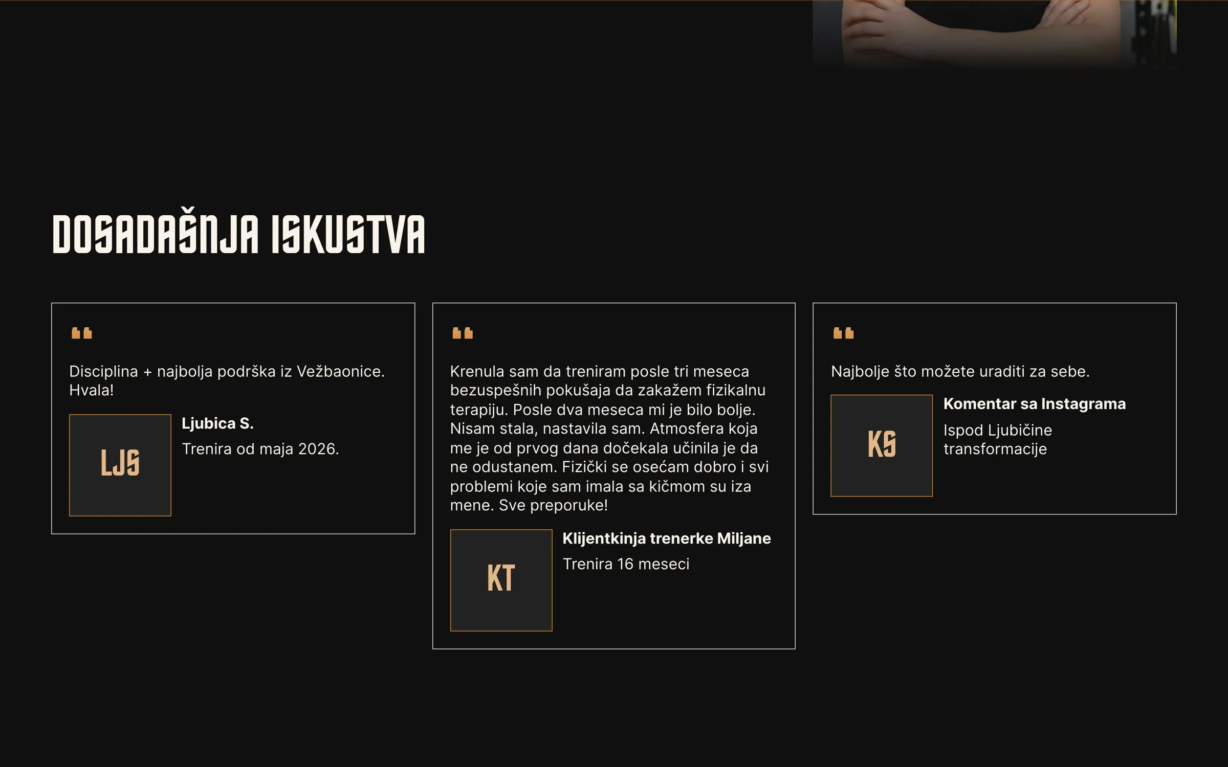
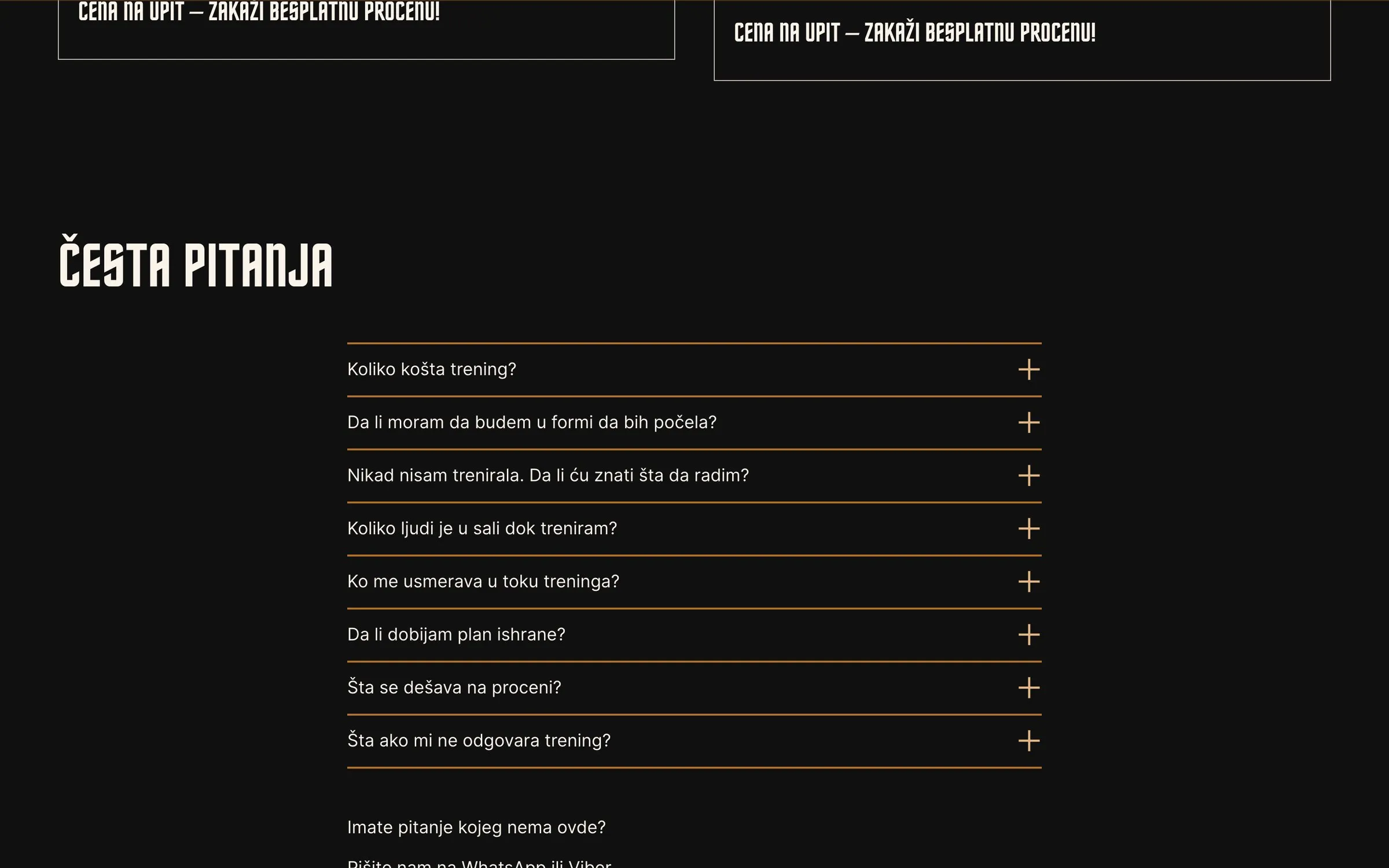
One Page, Every Answer
Sections the owners update themselves in Sanity
My Take
A new business doesn’t need a big website. It needs one page that answers the questions people actually ask: who you are, how it works, what others got out of it, and one obvious next step.
Everything else is speed and polish.